Image generation prompts.
Single source of truth for image generation across the marketing site and the book-creation pipeline. Every illustration produced for lil adventure follows the rules below. The visual coherence of the brand depends on it.
Last updated: 19 May 2026 (v3.1) · Working model: gpt-image-2 (via Pinpic / Koalaful generate)
This is an internal reference page. It's not linked from the public nav. Bookmark this URL and share it with the engineering team building the image generation pipeline. When the brand visual language changes, update this page and bump the "Last updated" date.
1. Global brand constraints (apply to ALL generations)
These constraints are non-negotiable and must be included in every prompt, regardless of style or scene. They enforce the brand.
One style-specific exception applies throughout this section: the Storybook Comic style (§2.6) uses saturated comic-book color and a full-bleed sky background instead of muted pastels on cream paper. Where a rule below has a Storybook Comic carve-out, it's called out inline under that rule.
Color palette — muted pastel (except Storybook Comic)
For all five non-comic styles, always include the literal palette wording in every prompt:
Palette strictly muted pastels: dusty lavender, pale sage mint, warm cream, dusty plum, soft peach blush. No saturated colors.
Hex values (for code-side validation, not for prompts):
- Dusty lavender
#E8E2F2— Primary pastel surface - Mint
#DFEDE4— Secondary pastel surface - Peach blush
#FBE4D5— Tertiary pastel surface - Warm cream
#FAF7F2— Paper / background - Dusty plum
#6B5B95— Brand accent + star motif color - Ink
#2C2A33— Text only, never image fills
Forbidden in non-comic prompts (negative descriptors): "saturated", "neon", "vivid", "bright"; bright greens, electric blues, royal blue, vivid reds, sunny yellow.
Storybook Comic exception: this style deliberately uses saturated comic-book color — warm red, leaf green, bright sky blue, sunny yellow. The forbidden-descriptors list above does not apply to §2.6. See the §2.6 master prompt for the comic palette string.
Background — cream paper, never transparent (except Storybook Comic)
The image model produces a literal checkerboard pattern if you ask for transparency. For all five non-comic styles, prompt for an opaque warm cream paper background, then pass the result through Koalaful:remove_background to extract the subject.
Required phrasing in non-comic prompts:
The background is solid warm cream paper. No checkerboard pattern, no transparency grid.
Storybook Comic exception: this style uses a full-bleed saturated sky blue background instead of cream paper. The transparency rule still holds — never request transparency directly — but the opaque background is sky, not cream. See §2.6 for the exact phrasing.
Brand motif — the plum star (applies to all six styles)
Every illustration must include a small four-pointed plum-colored star somewhere in the composition. This is the brand's recurring visual signature — it ties together the wordmark, the book cover, the hero accents, and every illustration. No exceptions: even Storybook Comic carries the plum star.
Required phrasing:
A small four-pointed plum-colored star floating [position relative to scene].
Placement varies per scene (above the rooftop, beside the moon, among the clouds, etc.) — but it must be present.
What to forbid in every prompt (applies to all six styles)
- No text, no words, no letters anywhere in the image
- No human faces, no characters, no eyes in scene-tile generations (so any child can be the protagonist of the world)
- No identifiable people of any kind
- Not cartoonish (unless using the Soft Cartoon or Storybook Comic style)
- Not flat vector — illustrations must feel hand-crafted
Composition rules (applies to all six styles)
- Centered composition with generous negative space around the subject
- Square format (1:1 aspect ratio) for tiles and icons
- Reads at thumbnail size — subject silhouette must be legible at ~48–60px display size. This rule is load-bearing for the homepage style picker; favor confident chunky shapes over fine detail when in doubt.
Style benchmarks (cite in prompts for stylistic anchoring)
When referencing artists/influences, only use these names — they're stylistically right and don't trigger safety filters:
- Beatrix Potter
- Tove Jansson
- "Scandinavian children's book reissues"
- "Classic editorial children's book illustration"
- "Classic mid-century children's book illustration"
- "Modern animated film keyframe" / "contemporary cartoon series title card"
Avoid naming any contemporary illustrator or living artist — it can trip OpenAI's safety filters even when the intent is purely stylistic.
2. Art style master prompts
Lil adventure offers six art styles. The parent picks one during the book creation flow. Each style has its own master prompt skeleton.
The first four are more editorial/modern; the last two (Crayon & Marker, Storybook Comic) skew classically kid-ish for parents who want stronger, more recognizable picture-book vibes.
The {SCENE} placeholder is where the per-page or per-tile scene description goes. Everything else is the brand-locked surrounding language.
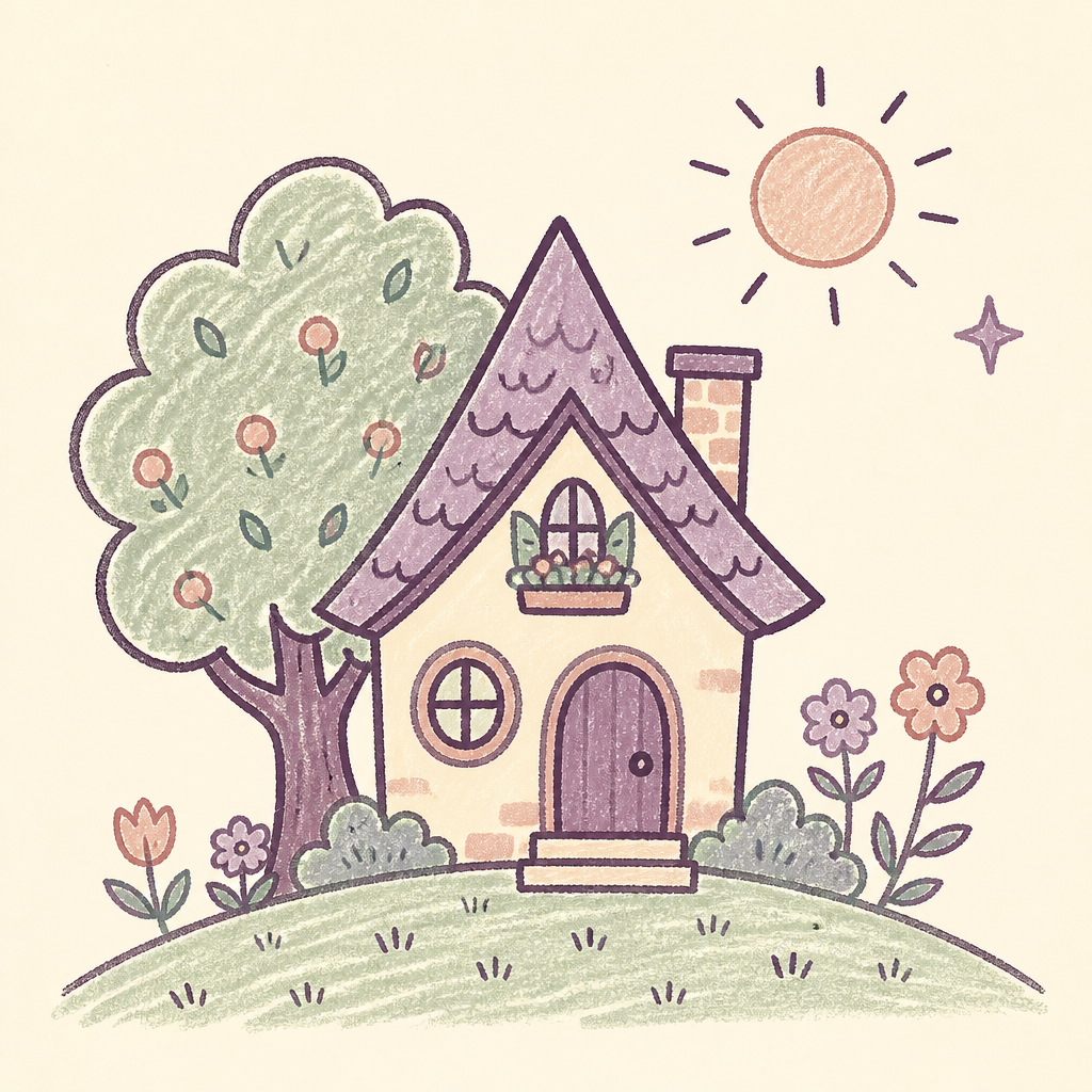
2.1 Watercolor + Ink (default)
The hero style. Used for the homepage world tiles and as the default art style for new books.
Master prompt:
Editorial children's book watercolor illustration on a clean warm cream paper background. {SCENE}. A small four-pointed plum-colored star floating {STAR_PLACEMENT}.
Style: soft watercolor washes with delicate ink linework, visible paper texture, hand-drawn imperfect brushstrokes.
Palette strictly muted pastels: dusty lavender, pale sage mint, warm cream, dusty plum, soft peach blush. No saturated colors.
Centered composition with generous negative space, square format. The background is solid warm cream paper, no checkerboard pattern, no transparency grid.
No text, no words, no faces, no characters. Beatrix Potter and Tove Jansson inspired. Premium boutique storybook aesthetic, not cartoonish, not flat vector.
Reference output:
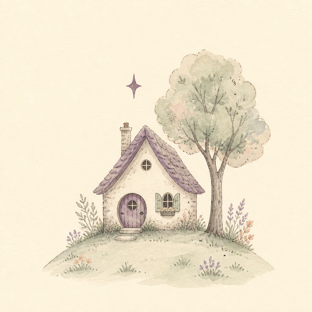
URL: https://files.tonta.io/FWLN9GhQq89xP6k4iSu9.png
2.2 Soft Cartoon
Modern picture-book cartoon style. Smooth, rounded, gently shaded. Distinct from watercolor — no painterly texture, no ink line. Reads as friendly and contemporary.
Master prompt:
Soft modern children's book cartoon illustration on a clean warm cream paper background. {SCENE}. A small four-pointed plum-colored star floating {STAR_PLACEMENT}.
Style: smooth rounded shapes with subtle soft shading, gentle gradients, clean confident lines, slightly chunky friendly forms. Contemporary picture-book cartoon aesthetic but in muted pastels.
Palette strictly muted pastels: dusty lavender, pale sage mint, warm cream, dusty plum, soft peach blush. No saturated colors.
Centered composition with generous negative space, square format. The background is solid warm cream paper.
No text, no faces, no characters. NOT watercolor, NOT painterly, NOT line drawing — smooth shaded cartoon shapes. Premium boutique storybook aesthetic, not flat vector.
Reference output:
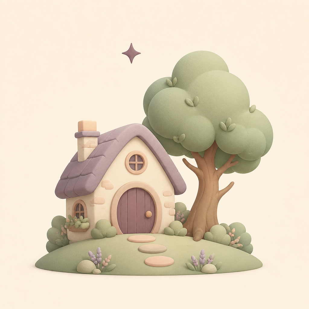
URL: https://files.tonta.io/QsM49wyJ0uf5qMNOpGa7.png
Important negation: the NOT watercolor, NOT painterly line is critical — without it, the model drifts back toward the watercolor style on retries.
2.3 Storybook Collage
Torn-paper collage in the tradition of classic picture-book illustration. Layered handmade-paper textures, deckle edges, visible paper grain.
Master prompt:
Torn paper collage children's book illustration on a clean warm cream paper background. {SCENE}. A small four-pointed plum-colored star floating {STAR_PLACEMENT}.
Style: hand-cut and torn paper pieces layered together with visible deckled edges, textured handmade paper grain, slightly imperfect rough edges, layered paper depth, subtle drop shadows where paper overlaps. Inspired by classic torn-paper collage picture book illustration techniques.
Palette strictly muted pastels: dusty lavender, pale sage mint, warm cream, dusty plum, soft peach blush. No saturated colors.
Centered composition with generous negative space, square format. The background is solid warm cream paper.
No text, no faces, no characters. NOT watercolor, NOT cartoon, NOT line drawing — distinctly papery cut-and-torn collage. Premium boutique storybook aesthetic.
Reference output:
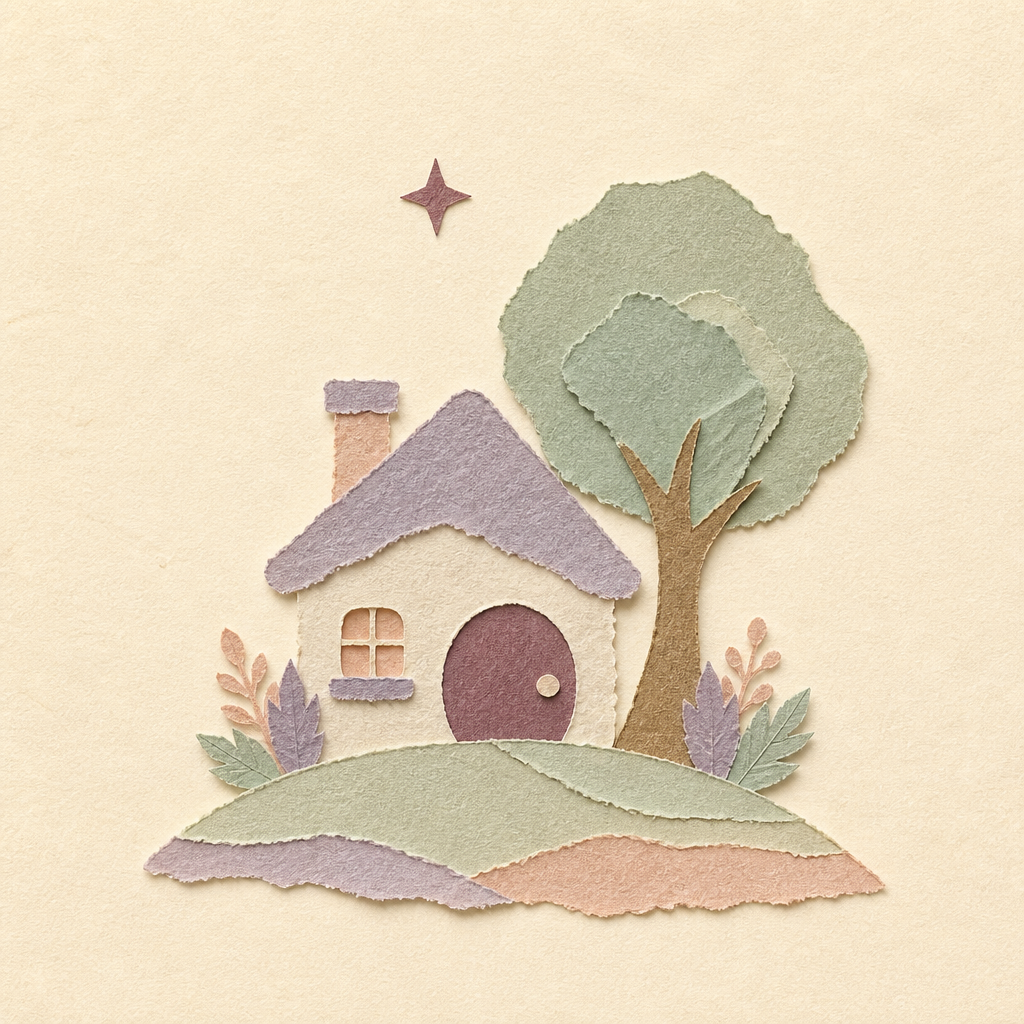
URL: https://files.tonta.io/1DWhfvqH8OFev1GCrR9j.png
2.4 Pencil Sketch
Sketchbook style — graphite linework with soft pastel watercolor tinting. Looser and more "artist's notebook" than the polished watercolor style.
Master prompt:
Hand-drawn pencil sketch children's book illustration on a clean warm cream paper background. {SCENE}. A small four-pointed plum-colored star floating {STAR_PLACEMENT}.
Style: loose graphite pencil sketch lines with visible hatching and gentle cross-hatching for shading, soft pastel watercolor wash colors lightly tinting the pencil work, slightly sketchy imperfect linework, visible paper texture. Like a thoughtful artist's sketchbook page.
Palette strictly muted pastels lightly tinting: dusty lavender, pale sage mint, warm cream, dusty plum, soft peach blush. No saturated colors.
Centered composition with generous negative space, square format. The background is solid warm cream paper.
No text, no faces, no characters. NOT watercolor-heavy, NOT cartoon, NOT collage — distinctly pencil-led linework with subtle pastel tints. Premium boutique storybook aesthetic.
Reference output:
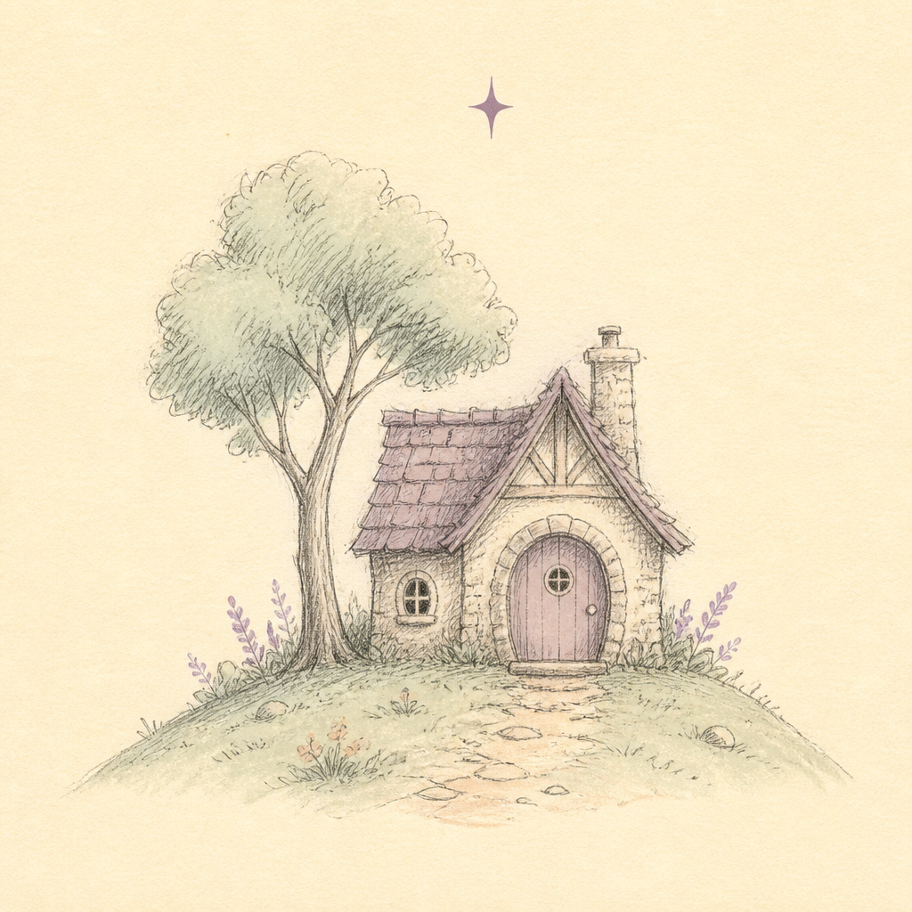
URL: https://files.tonta.io/ybwgZQldkerHOamNRS10.png
2.5 Crayon & Marker
The first of the two kid-leaning styles. Feels like a child's own drawing leveled up — chunky waxy crayon shading, confident dark plum marker outlines, occasional charming "outside the lines" coloring. Joyful, unintimidating, immediately recognizable to a young child as "art they can make too."
Master prompt:
Children's book illustration done in crayon and marker on a clean warm cream paper background. {SCENE}. A small four-pointed plum-colored star floating {STAR_PLACEMENT}.
Style: chunky waxy crayon shading with visible crayon texture and slightly imperfect coloring, bold confident marker outlines in soft dark plum, occasional small areas where the crayon color sits just outside the line in a charming way, the joyful energy of a child's drawing but executed with skill.
Palette strictly muted pastels: dusty lavender, pale sage mint, warm cream, dusty plum, soft peach blush. No saturated colors.
Centered composition with generous negative space, square format. The background is solid warm cream paper, no checkerboard pattern, no transparency grid.
No text, no faces, no characters. NOT watercolor, NOT painterly, NOT smooth cartoon — distinctly waxy crayon texture with marker outlines. Premium boutique storybook aesthetic.
Reference output:
URL: https://files.tonta.io/9uYJ3UE5UT62smX8y0Sk.png
Important negation: say NOT watercolor, NOT smooth cartoon explicitly — without it, the model softens the crayon texture into one of the existing styles.
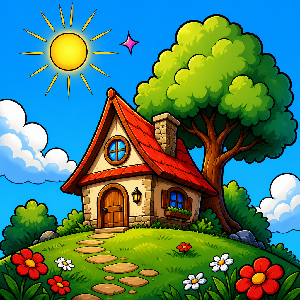
2.6 Storybook Comic
The second kid-leaning style, and the boldest in the lineup. Modern cel-shaded comic book aesthetic — thick confident black ink outlines, flat saturated color blocks with subtle gradient shading, full-bleed sky backgrounds. Reads like a contemporary cartoon series title card or modern animated film keyframe. The chunky simplification keeps the silhouette legible at thumbnail size, which matters for the homepage style picker.
This style deliberately breaks two global brand rules — muted-pastel palette and cream paper background — because the comic aesthetic depends on saturated full-bleed color. Those exceptions are documented in §1.
Master prompt:
Bold modern comic book illustration of a storybook scene. Full-bleed saturated sky blue background filling the entire frame, with one or two stylized white clouds. {SCENE}. A small four-pointed plum-colored star floating {STAR_PLACEMENT}.
Style: thick heavy black ink outlines with strong weight variation, confident bold contours around every shape, flat saturated color fills inside the outlines with subtle gradient shading for depth, modern graphic-novel polish, high contrast, cinematic punchy framing. Vibrant comic-book color: warm red, leaf green, bright sky blue, sunny yellow. Contemporary children's comic book aesthetic, modern animated film keyframe energy.
No text, no words, no speech bubbles, no panel borders. NO halftone dots, NO screentone, NO hatching, NO crosshatching, NO vintage newsprint texture, NO cream paper background. NOT watercolor, NOT crayon, NOT collage, NOT pencil sketch, NOT soft cartoon, NOT vintage comic, NOT flat vector. Distinctly modern bold full-color comic.
Reference output:
URL: https://files.tonta.io/jXKjKa1pzgwdTA32YG9L.png
Important negations: this style needs the most aggressive negation of any of the six. You must explicitly negate NO halftone dots, NO screentone, NO hatching, NO crosshatching, NO vintage newsprint texture — otherwise the model drifts into Sunday-funnies / Tintin-era vintage comic territory, which is the wrong aesthetic. You also need to explicitly negate the cream paper background (NO cream paper background), because the rest of the prompt corpus on this page heavily anchors the model toward cream backgrounds, and Storybook Comic specifically wants full-bleed sky.
Detail-vs-legibility note: the master prompt is deliberately tuned for chunky silhouette-legible output rather than dense graphic-novel detail. Detailed comic-page renders look gorgeous at full size but collapse into noise at the ~48–60px thumbnail size used in the homepage style picker. Keep it chunky. For in-book illustrations where detail can be afforded, scale up the prompt with more environmental description in the {SCENE} slot.
3. Reference scenes — currently in production
The six world tiles on the homepage. These were all generated with the Watercolor + Ink style. Use these scene descriptions as the {SCENE} slot when generating new variants in other styles, or as inspiration for in-book spreads set in the same world.
3.1 Moonlit Forest
- {SCENE}: Three slender stylized trees with rounded canopies cluster together, tiny glowing fireflies float between the branches like little dots of warm light, a soft crescent moon above, gentle grass at the base
- {STAR_PLACEMENT}: near the moon
- Live URL:
https://files.tonta.io/QLymGhZymwILn8Ln3lzo_512.webp
3.2 Starlit Sky
- {SCENE}: A peaceful night sky with a soft crescent moon, a small constellation of delicate stars connected by faint dotted lines, two or three larger four-pointed plum-colored stars scattered, a tiny pastel cloud drifting below
- {STAR_PLACEMENT}: (star is already part of the scene — multiple plum stars scattered across the sky)
- Live URL:
https://files.tonta.io/LXEIGjd5FOnbTaZok4zE_512.webp
3.3 Deep Blue Sea
- {SCENE}: A serene underwater scene with gentle wave-like ripples, a small piece of soft pastel coral, two or three tiny stylized fish swimming peacefully, a few drifting bubbles
- {STAR_PLACEMENT}: floating like a sea creature among the fish
- Live URL:
https://files.tonta.io/zyI3FM9wcV4sOdPEZ3dJ_512.webp
3.4 Dinosaur Valley
- {SCENE}: A single small friendly long-necked dinosaur silhouette in soft pastel tones standing peacefully, a few prehistoric ferns or rounded leafy plants nearby, two tiny rolling hills in the distance. Calm and abstract, more shape than character — no eyes, no teeth
- {STAR_PLACEMENT}: above the dinosaur's head like a wish
- Live URL:
https://files.tonta.io/g4A1BI333b8m5CctnkMe_512.webp
3.5 Castle Kingdom
- {SCENE}: A small fairytale castle with two or three rounded turrets topped with simple flag pennants, a single arched door at the base, a tiny soft pastel hill beneath
- {STAR_PLACEMENT}: above the tallest turret
- Live URL:
https://files.tonta.io/z7UD0pozEEww1DH6dvMC_512.webp
3.6 Cloud City
- {SCENE}: A whimsical cloud city with two or three soft fluffy pastel clouds floating, a tiny stylized house with a pointed roof perched on the largest cloud, a small hot-air-balloon shape drifting nearby
- {STAR_PLACEMENT}: above the highest cloud
- Live URL:
https://files.tonta.io/23Ntxlwo9f9gLRXQQcJ7_512.webp
3.7 Style comparison scene (cottage and tree)
All six art-style reference images use this single shared scene so the styles can be compared apples-to-apples.
- {SCENE}: A small storybook cottage with a pointed roof and round window sits beside a tall rounded tree, a gentle hill beneath, a few small flowers in the grass, a soft sun in the upper sky
- {STAR_PLACEMENT}: beside the sun
Storybook Comic variant: for §2.6 the scene description is rewritten slightly to suit the full-bleed comic aesthetic — the cream paper background is replaced with a saturated sky and stylized clouds, and the sun gains comic ray lines. See the §2.6 master prompt for the exact rewrite.
4. Post-processing — background removal
Generated images come back on a solid cream background (or, for §2.6 Storybook Comic, on a saturated sky background). To use them on colored tile backgrounds or anywhere the source background would clash, pass them through Koalaful:remove_background.
The cutout result caches per input URL — re-calling with the same URL is free and instant.
Workflow:
- Generate via
Koalaful:generate_image(orpinpic_generate_imageon the lil adventure side when available) - Take the returned Tonta URL
- Call
Koalaful:remove_backgroundwith that URL - Use the returned
processed_urlin the page
Edge cases:
- Watercolor edges with soft brushstrokes can sometimes fringe on cutout. If a cutout looks off, the simplest fix is to keep the cream-background version and let it sit against a cream UI surface instead of a colored tile.
- Storybook Comic cutouts: the saturated sky background usually cuts out cleanly because of the heavy black contour line, but the cloud shapes can ghost. Inspect the cutout — if clouds fringe, the easiest fix is to use the full-bleed comic image on its own colored tile and skip the cutout step.
5. Generation tips learned the hard way
- Pinpic prompts get rejected over ~600 characters. Shorter, denser, comma-separated prompts beat long flowing prose. Koalaful is more tolerant but the same principle helps. Storybook Comic is at the edge of the Pinpic limit because it needs aggressive negation — when Pinpic rejects, fall back to Koalaful generate.
- Em dashes and certain unicode characters sometimes trip the parser. If a prompt fails for no obvious reason, try replacing em dashes (—) with plain commas before assuming there's a real content issue.
- Asking for transparency produces a literal checkerboard. Never use
background: transparentdirectly — always cream background → remove_background as a separate step. (Storybook Comic uses saturated sky instead of cream, but the same principle holds: always opaque background, never transparent.) - Naming contemporary or living illustrators triggers safety filters. Stick to Beatrix Potter, Tove Jansson, and generic descriptors like "classic editorial children's book illustration," "classic mid-century children's book illustration," or "modern animated film keyframe."
- Quality parameter is unreliable.
mediumoften times out or downgrades tolowsilently. Default tolowfor style references and grid tiles — detail at small display sizes comes more from prompt specificity than from the quality flag. Only escalate tomediumfor hero images where the resolution loss matters. - Negate the wrong styles explicitly. When asking for any style other than the default watercolor, you must explicitly say "NOT watercolor" — the model drifts back to watercolor (the dominant style in training data for "children's book illustration") otherwise. The kid-leaning styles (Crayon & Marker, Storybook Comic) need especially aggressive negation against all the softer styles.
- Storybook Comic needs vintage-comic negation. Without explicit
NO halftone dots, NO screentone, NO hatching, NO vintage newsprint texture, the model drifts into Sunday-funnies / Tintin-era aesthetic, which is the wrong era. The target is modern cel-shaded comic, not classic newsprint comic. - Pinpic outages happen. When
lil adventure frontend:pinpic_generate_imagefails on simple prompts, switch toKoalaful:generate_image— the Tonta URLs work the same way on both pipelines. - Detail vs. thumbnail legibility is a real tradeoff. The §1 composition rule about reading at 48–60px is load-bearing for the homepage style picker. When generating tile references, favor chunky confident shapes over fine detail. Save the dense graphic-novel detail for in-book spread illustrations where the display size justifies it.
6. For the book-generation pipeline
When generating in-book illustrations:
- Always start the prompt with the art style master prompt skeleton from §2 (one of the six: Watercolor + Ink / Soft Cartoon / Storybook Collage / Pencil Sketch / Crayon & Marker / Storybook Comic based on the parent's choice during checkout)
- Replace
{SCENE}with a per-page scene description derived from the story content - Replace
{STAR_PLACEMENT}with a per-scene position for the plum star - For in-book illustrations where the child is the hero, you'll need to extend the "no faces, no characters" rule — the child should appear, but as a stylized silhouette or back-view figure, not with a rendered face. Faces are hard to match consistently across pages and risk the uncanny-valley problem. Recommend: child shown from behind, in silhouette, or with abstracted features matching the chosen art style.
- For full-bleed in-book illustrations (no need to extract from background), skip the
remove_backgroundstep and use the cream-background image directly — the cream becomes part of the spread. Storybook Comic in-book illustrations are naturally full-bleed (no cream paper anyway), so the cutout step is almost never needed for that style.
Suggested code-side validation before sending to image gen:
- For the five non-comic styles: every prompt must contain the literal muted-pastel palette string
- For Storybook Comic: every prompt must contain the saturated comic-palette string and the full-bleed sky-background phrasing
- Every prompt must contain "no text, no words"
- Every prompt must mention the plum star
- Every prompt should be under 600 characters total when going through Pinpic
- Every non-watercolor style must explicitly say "NOT watercolor"
- Storybook Comic prompts must additionally contain
NO halftone dotsandNO cream paper background
7. Versioning
Treat this page as a versioned source of truth. When updating:
- Bump the "Last updated" date at the top
- Note what changed in the changelog below
- Re-generate the six art-style reference images if any of the master prompts change, so the homepage display stays consistent with what the pipeline produces
Changelog
- 19 May 2026 (v3.1) — Rewrote §1 section headings and rule text to make the Storybook Comic exceptions truthful as-written rather than buried in a callout. "Color palette — strict pastel only" → "Color palette — muted pastel (except Storybook Comic)". "Background — always cream, never transparent" → "Background — cream paper, never transparent (except Storybook Comic)". Each rule body now states the comic exception inline. Tagged the universal rules (plum star, forbid list, composition) as applying to all six styles. Updated §6 validation list to split the palette check by style family.
- 19 May 2026 (v3) — Replaced §2.6 Bold Storybook with §2.6 Storybook Comic. New style uses modern cel-shaded comic aesthetic with full-bleed saturated sky background and thick black ink outlines. Added style-specific exceptions callout to §1 documenting that Storybook Comic departs from the muted-pastel palette and cream-background rules. Added "modern animated film keyframe" to safe style benchmarks. Added §5 tip #7 about negating vintage-comic markers (halftone, screentone, newsprint). Added §5 tip #9 about the detail-vs-thumbnail tradeoff. Updated §3.7 with a note about the Storybook Comic scene variant. Updated §4 to mention the comic-style cutout edge case. Updated §6 validation list with the new comic-specific requirements.
- 18 May 2026 (v2) — Added two kid-leaning art styles: §2.5 Crayon & Marker and §2.6 Bold Storybook. Both reference images generated using the cottage-and-tree comparison scene (now documented as §3.7). Updated style count from four to six throughout. Added "classic mid-century children's book illustration" to the safe style benchmarks list. Updated §5 quality-parameter tip to recommend
lowby default. Added explicit-negation validation to §6. - 18 May 2026 — Initial version. Four art styles defined. Six world tile scenes documented. Watercolor + Ink confirmed as the default style.